
Down East Vodka
The Spirit of Central Illinois
Branding, packaging, print
Problem: Walk down any vodka aisle in a liquor store and all you'll see is tall, skinny bottles with blue labels. Stepping into such a saturated market with a new product—we knew Down East needed to stand out.
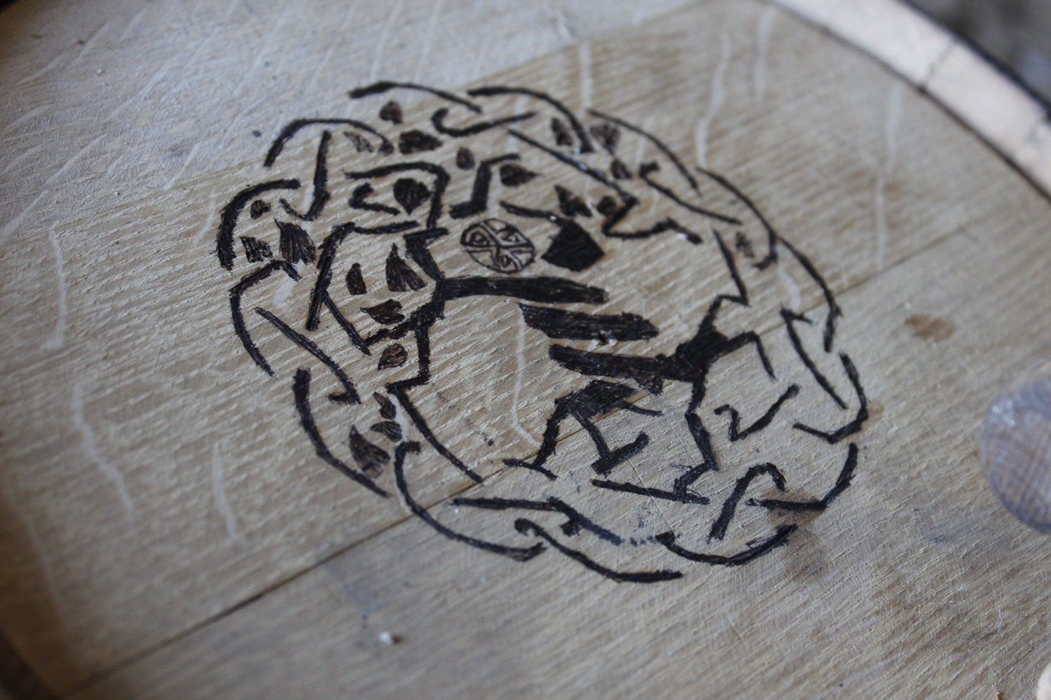
Solution: I created a packaging that’s the exact opposite of what you'd expect from vodka. I wanted to highlight the handcrafted distilling style as well give a nod to our farming roots. I did this by using a bottle that resembles that of a bourbon, an earthy color palette that looks like harvest time and rustic typography.
Results: In just eight months, we’ve sold almost 4,000 bottles between St. Louis and Chicago. We’ve tripled our production per batch and Down East has been featured in several craft spirit magazines!